Putting it all together - colour decisions...


Type...


Type...
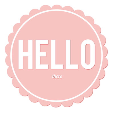
As you can see I'm really into these classic sans serif looking typefaces at the minute (with the exception of Adelle but it's always too nice to resist).

I have chosen these specifically because I think with the right colour palette, surrounding motifs/shapes they can look feminine but strong all at once. I think because Esther's blog revolves around the kitchen and cooking this is a good aspect to push through the design. The 'woman in the kitchen' role is played by the decoration, the frills but fundamentally underneath is a strong matriarchal figure. We've all known those women who stand in their kitchens, slaving over the stove- in tv, films, real life. And I think because thats quite a old fashioned way of looking at a woman who likes to cook, that sort of fits in with the kitsch retro feel of the design I am aiming for. That might not make sense but I hope you can understand what I'm getting at.
As a side note, I was in two minds about branding the blog or Esther as a blogger. Esther Walker Vs Recipe Rifle if you like. I think it's safer to go for Esther herself, but promote the blog within that.
No comments:
Post a Comment